August 21, 2013 python matplotlib prettyplotlib programming data visualization dataviz
A while back I wrote a few tutorials about how to work with Python’s plotting library, matplotlib, so that it behaves nicely and produces beautiful plots. Well, I got tired of tweaking every single figure individually so I wrote this library, prettyplotlib to have pretty default plots in Python’s matplotlib.
I truly believe that poor visualizations obstruct scientific progress, and this is my contribution.
A couple motivating examples are below, but if you just want an overview, check out the Comparison to matplotlib defaults, Examples Gallery, and Examples with code on Github.
To install, do the usual pip install stuff:
pip install prettyplotlib
I truly hope you enjoy using this library! If you have any comments or suggestions, let me know!
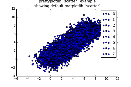
prettyplotlib.scatter
The default matplotlib color cycle is not pretty to look at. What’s even worse is
that if you just do a scatter plot, then it doesn’t cycle at all through any values
import matplotlib.pyplot as plt
# Set the random seed for consistency
np.random.seed(12)
fig, ax = plt.subplots(1)
# Show the whole color range
for i in range(8):
x = np.random.normal(loc=i, size=1000)
y = np.random.normal(loc=i, size=1000)
ax.scatter(x, y, label=str(i))
ax.legend()
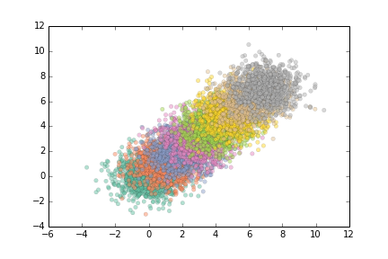
ax.set_title('prettyplotlib `scatter` example\nshowing default matplotlib `scatter`')
fig.savefig('scatter_matplotlib_default.png')
Before prettyplotlib: how to make nice plots
Now I’m going to take you through ALL the steps I used to take to make nice looking plots.
First, change the colors with brewer2mpl:
# Get "Set2" colors from ColorBrewer (all colorbrewer scales: http://bl.ocks.org/mbostock/5577023)
set2 = brewer2mpl.get_map('Set2', 'qualitative', 8).mpl_colors
...
color = set2[i]
ax.scatter(x, y, label=str(i), facecolor=color)
The full code is,
import matplotlib.pyplot as plt
import brewer2mpl

# Get "Set2" colors from ColorBrewer (all colorbrewer scales: http://bl.ocks.org/mbostock/5577023)
set2 = brewer2mpl.get_map('Set2', 'qualitative', 8).mpl_colors

# Set the random seed for consistency
np.random.seed(12)

fig, ax = plt.subplots(1)

# Show the whole color range
for i in range(8):
    x = np.random.normal(loc=i, size=1000)
    y = np.random.normal(loc=i, size=1000)
    color = set2[i]
    ax.scatter(x, y, label=str(i), color=color)

fig.savefig('scatter_matplotlib_improved_01_changed_colors.png')
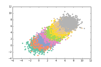
This looks nice, almost like an impressionist painting, but it’s still hard to
see overlaps here. So let’s fill the symbols with 0.5 opacity using
alpha=0.5.
ax.scatter(x, y, label=str(i), color=color, alpha=0.5)
The full code is,
import matplotlib.pyplot as plt
import brewer2mpl

# Get "Set2" colors from ColorBrewer (all colorbrewer scales: http://bl.ocks.org/mbostock/5577023)
set2 = brewer2mpl.get_map('Set2', 'qualitative', 8).mpl_colors

# Set the random seed for consistency
np.random.seed(12)

fig, ax = plt.subplots(1)

# Show the whole color range
for i in range(8):
    x = np.random.normal(loc=i, size=1000)
    y = np.random.normal(loc=i, size=1000)
    color = set2[i]
    ax.scatter(x, y, label=str(i), color=color, alpha=0.5)

fig.savefig('scatter_matplotlib_improved_02_added_alpha.png')
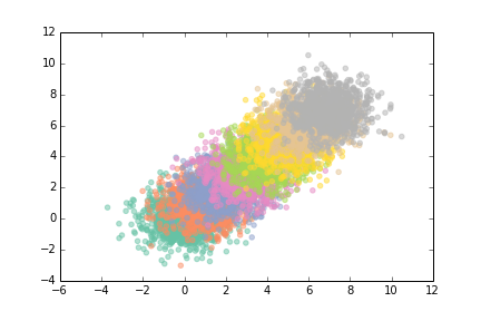
This is still pretty lovely and impressionist-y but I still didn’t like that it
was hard to see when the dots overlapped. So let’s add a black outline, and
specify that color is just the facecolor:
ax.scatter(x, y, label=str(i), alpha=0.5, edgecolor='black',
facecolor=color)
The full code is,
import matplotlib.pyplot as plt
import brewer2mpl

# Get "Set2" colors from ColorBrewer (all colorbrewer scales: http://bl.ocks.org/mbostock/5577023)
set2 = brewer2mpl.get_map('Set2', 'qualitative', 8).mpl_colors

# Set the random seed for consistency
np.random.seed(12)

fig, ax = plt.subplots(1)

# Show the whole color range
for i in range(8):
    x = np.random.normal(loc=i, size=1000)
    y = np.random.normal(loc=i, size=1000)
    color = set2[i]
    ax.scatter(x, y, label=str(i), alpha=0.5, edgecolor='black', facecolor=color)

fig.savefig('scatter_matplotlib_improved_03_added_outline.png')
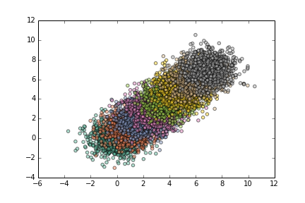
Ack, but those lines are too thick … let’s think them down to linewidth=0.15
ax.scatter(x, y, label=str(i), alpha=0.5, edgecolor='black',
facecolor=color, linewidth=0.15)
The full code is,
import matplotlib.pyplot as plt
import brewer2mpl

# Get "Set2" colors from ColorBrewer (all colorbrewer scales: http://bl.ocks.org/mbostock/5577023)
set2 = brewer2mpl.get_map('Set2', 'qualitative', 8).mpl_colors

# Set the random seed for consistency
np.random.seed(12)

fig, ax = plt.subplots(1)

# Show the whole color range
for i in range(8):
    x = np.random.normal(loc=i, size=1000)
    y = np.random.normal(loc=i, size=1000)
    color = set2[i]
    ax.scatter(x, y, label=str(i), alpha=0.5, edgecolor='black', facecolor=color, linewidth=0.15)
fig.savefig('scatter_matplotlib_improved_04_thinned_outline.png')
Now we’re getting somewhere. This looks very lovely. Don’t you want to just cuddle up with that cute plot?
What are those top and right axes lines really doing for us? They’re boxing the
data in, but we can do that with our eyes from the other axis lines. So let’s
remove the top and right axis lines using ax.spines:
# Remove top and right axes lines ("spines")
spines_to_remove = ['top', 'right']
for spine in spines_to_remove:
ax.spines[spine].set_visible(False)
The full code is,
import matplotlib.pyplot as plt
import brewer2mpl

# Get "Set2" colors from ColorBrewer (all colorbrewer scales: http://bl.ocks.org/mbostock/5577023)
set2 = brewer2mpl.get_map('Set2', 'qualitative', 8).mpl_colors

# Set the random seed for consistency
np.random.seed(12)

fig, ax = plt.subplots(1)

# Show the whole color range
for i in range(8):
    x = np.random.normal(loc=i, size=1000)
    y = np.random.normal(loc=i, size=1000)
    color = set2[i]
    ax.scatter(x, y, label=str(i), alpha=0.5, edgecolor='black', facecolor=color, linewidth=0.15)

# Remove top and right axes lines ("spines")
spines_to_remove = ['top', 'right']
for spine in spines_to_remove:
    ax.spines[spine].set_visible(False)
fig.savefig('scatter_matplotlib_improved_05_removed_top_right_spines.png')

Oops, but we still have the ticks on the top and right axes. We’ll need to get rid of them. Actually, why don’t we just get rid of all ticks altogether? We can tell by the position of the number where it indicates, so we don’t need an additional tick.
# Get rid of ticks. The position of the numbers is informative enough of
# the position of the value.
ax.xaxis.set_ticks_position('none')
ax.yaxis.set_ticks_position('none')
Here’s the full code:
import matplotlib.pyplot as plt
import brewer2mpl

# Get "Set2" colors from ColorBrewer (all colorbrewer scales: http://bl.ocks.org/mbostock/5577023)
set2 = brewer2mpl.get_map('Set2', 'qualitative', 8).mpl_colors

# Set the random seed for consistency
np.random.seed(12)

fig, ax = plt.subplots(1)

# Show the whole color range
for i in range(8):
    x = np.random.normal(loc=i, size=1000)
    y = np.random.normal(loc=i, size=1000)
    color = set2[i]
    ax.scatter(x, y, label=str(i), alpha=0.5, edgecolor='black', facecolor=color, linewidth=0.15)

# Remove top and right axes lines ("spines")
spines_to_remove = ['top', 'right']
for spine in spines_to_remove:
    ax.spines[spine].set_visible(False)

# Get rid of ticks. The position of the numbers is informative enough of
# the position of the value.
ax.xaxis.set_ticks_position('none')
ax.yaxis.set_ticks_position('none')
fig.savefig('scatter_matplotlib_improved_06_removed_ticks.png')
Ahh, much better. But we won’t stop there. Now we’ll tweak the remaining pieces
of the figure. For the rest of the spines, let’s thin the line down to 0.5
points instead of the default 1.0 points. Also, we’ll change it from pure
black to a slightly lighter dark grey. Here they are side by side:
fig, axes = plt.subplots(2)
axes[0].set_axis_bgcolor('black')
axes[0].text(0.5, 0.5, 'black', color='white', fontsize=24, va='center', ha='center')
axes[1].set_axis_bgcolor('#262626')
axes[1].text(0.5, 0.5, 'almost black', fontsize=24, color='white', va='center', ha='center')
fig.savefig('black_vs_almost_black.png')
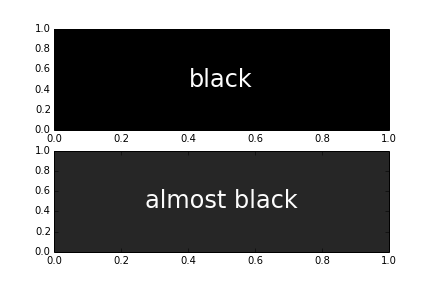
So not a huge difference, and the dark grey still looks pretty black, but it’s a little more pleasant on the eyes to use a dark grey instead of black. There’s very few things in nature that are truly black. Just look at shadows! They’re just dark grey, or blue, or red or purple. But I digress. Back to plotting libraries…
To change the x-axis and y-axis line colors, and the outlines of the scatter symbols from black to dark grey, we’ll do:
# For remaining spines, thin out their line and change the black to a slightly off-black dark grey
almost_black = '#262626'
...
ax.scatter(x, y, label=str(i), alpha=0.5, edgecolor='black', facecolor=color, linewidth=0.15)`
...
spines_to_keep = ['bottom', 'left']
for spine in spines_to_keep:
    ax.spines[spine].set_linewidth(0.5)
    ax.spines[spine].set_color(almost_black)
The full code is,
import matplotlib.pyplot as plt
import brewer2mpl

# Get "Set2" colors from ColorBrewer (all colorbrewer scales: http://bl.ocks.org/mbostock/5577023)
set2 = brewer2mpl.get_map('Set2', 'qualitative', 8).mpl_colors

# Set the random seed for consistency
np.random.seed(12)

# Save a nice dark grey as a variable
almost_black = '#262626'

fig, ax = plt.subplots(1)

# Show the whole color range
for i in range(8):
    x = np.random.normal(loc=i, size=1000)
    y = np.random.normal(loc=i, size=1000)
    color = set2[i]
    ax.scatter(x, y, label=str(i), alpha=0.5, edgecolor=almost_black, facecolor=color, linewidth=0.15)

# Remove top and right axes lines ("spines")
spines_to_remove = ['top', 'right']
for spine in spines_to_remove:
    ax.spines[spine].set_visible(False)

# Get rid of ticks. The position of the numbers is informative enough of
# the position of the value.
ax.xaxis.set_ticks_position('none')
ax.yaxis.set_ticks_position('none')

# For remaining spines, thin out their line and change the black to a slightly off-black dark grey
spines_to_keep = ['bottom', 'left']
for spine in spines_to_keep:
    ax.spines[spine].set_linewidth(0.5)
    ax.spines[spine].set_color(almost_black)
fig.savefig('scatter_matplotlib_improved_07_axis_black_to_almost_black.png')

This is nice. But if you look closely, the tick labels are still black :( We have to change them separately, using
# Change the labels to the off-black
ax.xaxis.label.set_color(almost_black)
ax.yaxis.label.set_color(almost_black)
And while we’re at it, let’s add a title and make it dark grey too.
# Change the axis title to off-black
ax.title.set_color(almost_black)
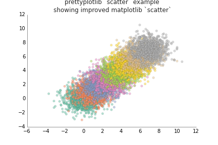
ax.set_title('prettyplotlib `scatter` example\nshowing improved matplotlib `scatter`')
The full code is,
import matplotlib.pyplot as plt
import brewer2mpl

# Get "Set2" colors from ColorBrewer (all colorbrewer scales: http://bl.ocks.org/mbostock/5577023)
set2 = brewer2mpl.get_map('Set2', 'qualitative', 8).mpl_colors

# Set the random seed for consistency
np.random.seed(12)

# Save a nice dark grey as a variable
almost_black = '#262626'

fig, ax = plt.subplots(1)

# Show the whole color range
for i in range(8):
    x = np.random.normal(loc=i, size=1000)
    y = np.random.normal(loc=i, size=1000)
    color = set2[i]
    ax.scatter(x, y, label=str(i), alpha=0.5, edgecolor=almost_black, facecolor=color, linewidth=0.15)

# Remove top and right axes lines ("spines")
spines_to_remove = ['top', 'right']
for spine in spines_to_remove:
    ax.spines[spine].set_visible(False)

# Get rid of ticks. The position of the numbers is informative enough of
# the position of the value.
ax.xaxis.set_ticks_position('none')
ax.yaxis.set_ticks_position('none')

# For remaining spines, thin out their line and change the black to a slightly off-black dark grey
spines_to_keep = ['bottom', 'left']
for spine in spines_to_keep:
    ax.spines[spine].set_linewidth(0.5)
    ax.spines[spine].set_color(almost_black)

# Change the labels to the off-black
ax.xaxis.label.set_color(almost_black)
ax.yaxis.label.set_color(almost_black)

# Change the axis title to off-black
ax.title.set_color(almost_black)

ax.set_title('prettyplotlib `scatter` example\nshowing improved matplotlib `scatter`')
fig.savefig('scatter_matplotlib_improved_08_labels_black_to_almost_black.png')
If you remember in the original example, we also had an axis legend, using
ax.legend()
So let’s add it to this code, too.
import matplotlib.pyplot as plt
import brewer2mpl

# Get "Set2" colors from ColorBrewer (all colorbrewer scales: http://bl.ocks.org/mbostock/5577023)
set2 = brewer2mpl.get_map('Set2', 'qualitative', 8).mpl_colors

# Set the random seed for consistency
np.random.seed(12)

# Save a nice dark grey as a variable
almost_black = '#262626'

fig, ax = plt.subplots(1)

# Show the whole color range
for i in range(8):
    x = np.random.normal(loc=i, size=1000)
    y = np.random.normal(loc=i, size=1000)
    color = set2[i]
    ax.scatter(x, y, label=str(i), alpha=0.5, edgecolor=almost_black, facecolor=color, linewidth=0.15)

# Remove top and right axes lines ("spines")
spines_to_remove = ['top', 'right']
for spine in spines_to_remove:
    ax.spines[spine].set_visible(False)

# Get rid of ticks. The position of the numbers is informative enough of
# the position of the value.
ax.xaxis.set_ticks_position('none')
ax.yaxis.set_ticks_position('none')

# For remaining spines, thin out their line and change the black to a slightly off-black dark grey
almost_black = '#262626'
spines_to_keep = ['bottom', 'left']
for spine in spines_to_keep:
    ax.spines[spine].set_linewidth(0.5)
    ax.spines[spine].set_color(almost_black)

# Change the labels to the off-black
ax.xaxis.label.set_color(almost_black)
ax.yaxis.label.set_color(almost_black)

# Change the axis title to off-black
ax.title.set_color(almost_black)

ax.legend()

ax.set_title('prettyplotlib `scatter` example\nshowing improved matplotlib `scatter`')
fig.savefig('scatter_matplotlib_improved_09_ugly_legend.png')
There are many things I don’t like about this legend.
- First of all, why does it have such a thick border line? What does that really add to our interpretation of the legend? The black line is so thick that it distracts from what we’re trying to portray - which label goes with which color.
- Why does it show three points? Does this legend think I’m dumb and can’t figure out which symbol goes with which label after one iteration, so it does it three times?
- Finally, the legend labels are pure black. Maybe you notice it too, after comparing to x-axis and y-axis lines and labels.
We’ll accomplish these three things using this code:
# Remove the line around the legend box, and instead fill it with a light grey
# Also only use one point for the scatterplot legend because the user will
# get the idea after just one, they don't need three.
light_grey = np.array([float(248)/float(255)]*3)
legend = ax.legend(frameon=True, scatterpoints=1, fontcolor=almost_black)
rect = legend.get_frame()
rect.set_facecolor(light_grey)
rect.set_linewidth(0.0)

# Change the legend label colors to almost black, too
texts = legend.texts
for t in texts:
    t.set_color(almost_black)
Now our code is pretty huge …
import matplotlib.pyplot as plt
import brewer2mpl
# Get "Set2" colors from ColorBrewer (all colorbrewer scales: http://bl.ocks.org/mbostock/5577023)
set2 = brewer2mpl.get_map('Set2', 'qualitative', 8).mpl_colors
# Set the random seed for consistency
np.random.seed(12)
# Save a nice dark grey as a variable
almost_black = '#262626'
fig, ax = plt.subplots(1)
# Show the whole color range
for i in range(8):
x = np.random.normal(loc=i, size=1000)
y = np.random.normal(loc=i, size=1000)
color = set2[i]
ax.scatter(x, y, label=str(i), alpha=0.5, edgecolor=almost_black, facecolor=color, linewidth=0.15)
# Remove top and right axes lines ("spines")
spines_to_remove = ['top', 'right']
for spine in spines_to_remove:
ax.spines[spine].set_visible(False)
# Get rid of ticks. The position of the numbers is informative enough of
# the position of the value.
ax.xaxis.set_ticks_position('none')
ax.yaxis.set_ticks_position('none')
# For remaining spines, thin out their line and change the black to a slightly off-black dark grey
almost_black = '#262626'
spines_to_keep = ['bottom', 'left']
for spine in spines_to_keep:
ax.spines[spine].set_linewidth(0.5)
ax.spines[spine].set_color(almost_black)
# Change the labels to the off-black
ax.xaxis.label.set_color(almost_black)
ax.yaxis.label.set_color(almost_black)
# Change the axis title to off-black
ax.title.set_color(almost_black)
# Remove the line around the legend box, and instead fill it with a light grey
# Also only use one point for the scatterplot legend because the user will
# get the idea after just one, they don't need three.
light_grey = np.array([float(248)/float(255)]*3)
legend = ax.legend(frameon=True, scatterpoints=1)
rect = legend.get_frame()
rect.set_facecolor(light_grey)
rect.set_linewidth(0.0)
# Change the legend label colors to almost black, too
texts = legend.texts
for t in texts:
t.set_color(almost_black)
ax.set_title('prettyplotlib `scatter` example\nshowing improved matplotlib `scatter`')
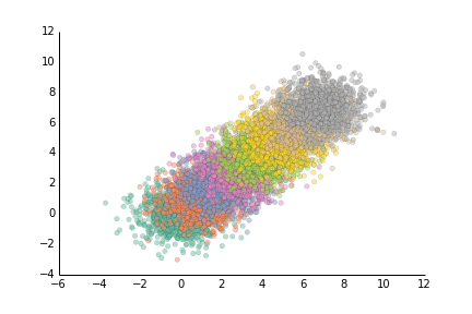
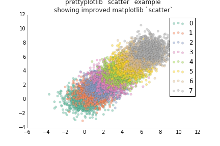
fig.savefig('scatter_matplotlib_improved_10_pretty_legend.png')
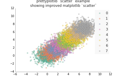
Aaaaaaaaaaand I got tired of doing all those steps, EVERY time I wanted to make a simple scatterplot. So I wrote
prettyplotlib. Here’s an
illustrative example of how awesome prettyplotlib is, and how it will save
all the time you spent agonizing over making your matplotlib plots beautiful.
import prettyplotlib as ppl
import numpy as np

fig, ax = ppl.subplots()

# Set the random seed for consistency
np.random.seed(12)

# Show the whole color range
for i in range(8):
    x = np.random.normal(loc=i, size=1000)
    y = np.random.normal(loc=i, size=1000)
    ppl.scatter(ax, x, y, label=str(i))

ppl.legend()

ax.set_title('prettyplotlib `scatter` example\nshowing default color cycle and scatter params')
fig.savefig('scatter_prettyplotlib_default.png')
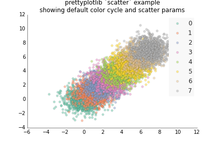
The only commands that were different from the very first example with matplotlib are:
ppl.scatter(ax, x, y, label=str(i), facecolor='none')
instead of:
ax.scatter(x, y, label=str(i))
And a different legend command:
ppl.legend(ax)
instead of:
ax.legend()
If you really want to get the original matplotlib style back in prettyplotlib, you can do:
import prettyplotlib as ppl

# Set the random seed for consistency
np.random.seed(12)

fig, ax = plt.subplots(1)

#mpl.rcParams['axis.color_cycle'] = ['blue']

# Show the whole color range
for i in range(8):
    x = np.random.normal(loc=i, size=1000)
    y = np.random.normal(loc=i, size=1000)
    ax.scatter(x, y, label=str(i), facecolor='blue', edgecolor='black', linewidth=1)

# Get back the top and right axes lines ("spines")
spines_to_remove = ['top', 'right']
for spine in spines_to_remove:
    ax.spines[spine].set_visible(True)

# Get back the ticks. The position of the numbers is informative enough of
# the position of the value.
ax.xaxis.set_ticks_position('both')
ax.yaxis.set_ticks_position('both')

# For all the spines, make their line thicker and return them to be black
all_spines = ['top', 'left', 'bottom', 'right']
for spine in all_spines:
    ax.spines[spine].set_linewidth(1.0)
    ax.spines[spine].set_color('black')

# Change the labels back to black
ax.xaxis.label.set_color('black')
ax.yaxis.label.set_color('black')

# Change the axis title also back to black
ax.title.set_color('black')

# Remove the line around the legend box, and instead fill it with a light grey
# Also only use one point for the scatterplot legend because the user will
# get the idea after just one, they don't need three.
ax.legend()

ax.set_title('prettyplotlib `scatter` example\nrevert everything back to default matplotlib parameters')
fig.savefig('scatter_prettyplotlib_back_to_matplotlib_default.png')
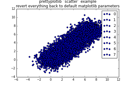
Notice that the default calls of ax.scatter and ax.legend do the usual
thing. This is important, because for prettyplotlib to work, you’ll need to
use a syntax that’s different from the usual matplotlib one: ppl.scatter(ax, x, y...) instead of ax.scatter(x, y, ...)
prettyplotlib.pcolormesh: Improving heatmaps in matplotlib
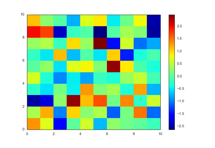
Both positive and negative values
The default matplotlib pcolormesh heatmaps use a rainbow colormap, which has
been known to mislead data visualization. Specifically, [“the rainbow color map
is universally inferior to all other color maps”](http://www.jwave.vt.edu/~rkri
z/Projects/create_color_table/color_07.pdf). Unfortunately, matplotlib took
its default colors from MATLAB, and there the default is also rainbow.
import matplotlib.pyplot as plt
import numpy as np

fig, ax = plt.subplots(1)

np.random.seed(10)

#ax.pcolor(np.random.randn((10,10)))
#ax.pcolor(np.random.randn(10), np.random.randn(10))
p = ax.pcolormesh(np.random.randn(10,10))
fig.colorbar(p)
fig.savefig('pcolormesh_matplotlib_default.png')
Using the same zero-centered randomly distributed gaussian distribution, we can
plot it using prettyplotlib with a few modifications in syntax:
ppl.pcolormesh(fig, ax, np.random.randn(10,10))
You’ll notice that the “hot” (large, positive) color is still red, and the “cold” (small, negative) color is still blue, but the in between colors are gradations of red and blue, so it’s easier to tell the difference between values.
import prettyplotlib as ppl
import numpy as np

fig, ax = ppl.subplots(1)

np.random.seed(10)

ppl.pcolormesh(fig, ax, np.random.randn(10,10))
fig.savefig('pcolormesh_prettyplotlib_default.png')

You may have also noticed similar changes as were made in prettyplotlib.scatter,
where axis lines were removed, and blacks were changed to almost black.
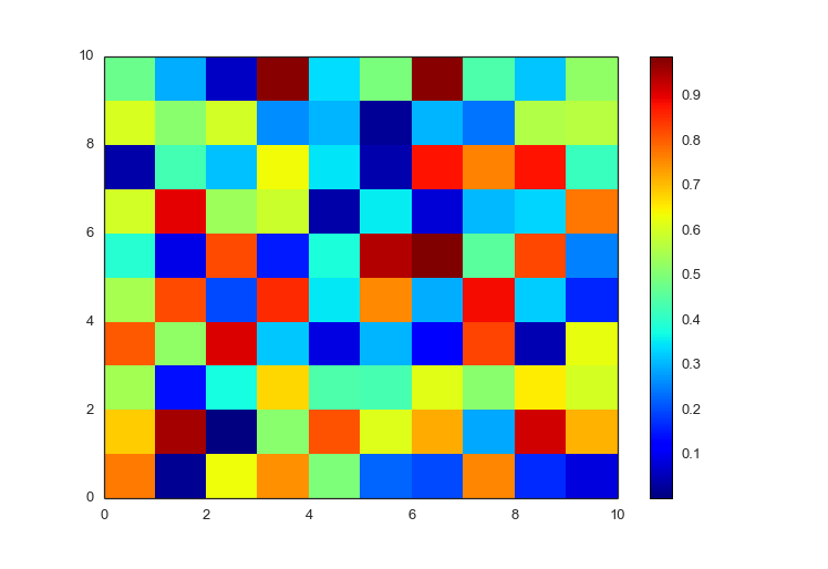
Only positive (or negative) values
If your data is only positive (or negative), matplotlib does nothing to change
the color scale. It’s still a rainbow, but look at the colorbar, the range is
different (0 to 1 instead of -2 to +2)
import prettyplotlib as ppl
import numpy as np

fig, ax = ppl.subplots(1)

np.random.seed(10)

p = ax.pcolormesh(np.random.uniform(size=(10,10)))
fig.colorbar(p)
fig.savefig('pcolormesh_matplotlib_positive_default.png')
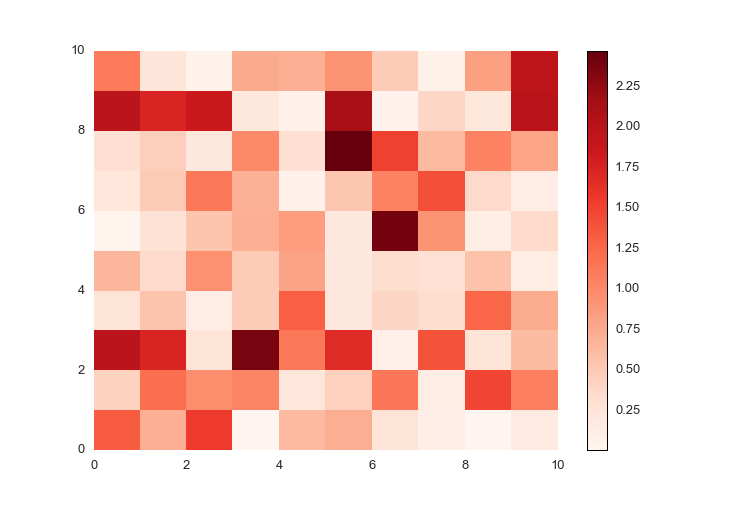
If your data is only positive or negative, then prettyplotlib will auto-detect
this and use a single-color colormap. The default for positive data is the
reds colormap.
import prettyplotlib as ppl
import numpy as np

fig, ax = ppl.subplots(1)

np.random.seed(10)

ppl.pcolormesh(fig, ax, np.abs(np.random.randn(10,10)))
fig.savefig('pcolormesh_prettyplotlib_positive.png')
And the default for negative data is the blues colormap.
import prettyplotlib as ppl
import numpy as np

fig, ax = ppl.subplots(1)

np.random.seed(10)

ppl.pcolormesh(fig, ax, -np.abs(np.random.randn(10,10)))
fig.savefig('pcolormesh_prettyplotlib_negative.png')

Add x or y tick labels
Plus you can add x- and y-ticklabels directly!
Normally, when you add x- and y-ticklabels on pcolormesh in matplotlib,
they’re not centered on the blocks, and you have to do a lot of annoying work
just getting a label on each box. You have to specify the xticks explicitly,
since you want to label each box.
xticks = range(10)
yticks = range(10)

xticklabels=string.uppercase[:10]
yticklabels=string.lowercase[-10:]

ax.set_xticks(xticks)
ax.set_xticklabels(xticklabels)

ax.set_yticks(yticks)
ax.set_yticklabels(yticklabels)
The full, matplotlib code is:
import prettyplotlib as ppl
from prettyplotlib import plt
import numpy as np
import string

fig, ax = plt.subplots(1)

np.random.seed(10)

p = ax.pcolormesh(np.abs(np.random.randn(10,10)))
fig.colorbar(p)

xticks = range(10)
yticks = range(10)

xticklabels=string.uppercase[:10]
yticklabels=string.lowercase[-10:]

ax.set_xticks(xticks)
ax.set_xticklabels(xticklabels)

ax.set_yticks(yticks)
ax.set_yticklabels(yticklabels)


fig.savefig('pcolormesh_matplotlib_positive_labels.png')
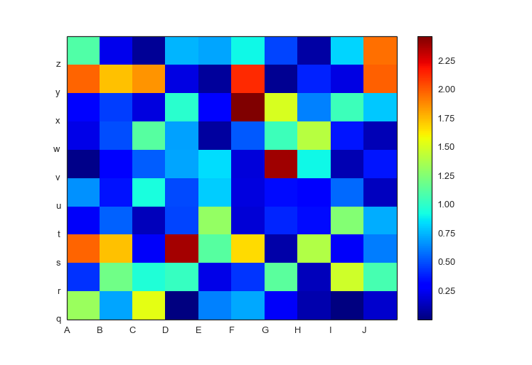
But prettyplotlib.pcolormesh assumes that you want the xticklabels and
yticklabels on each block, and makes it easy to specify.
ppl.pcolormesh(fig, ax, np.random.uniform(size=(10,10)),
               xticklabels=string.uppercase[:10],
               yticklabels=string.lowercase[-10:])
The full prettyplotlib code is,
import prettyplotlib as ppl
import numpy as np
import string

fig, ax = ppl.subplots(1)

np.random.seed(10)

ppl.pcolormesh(fig, ax, np.random.randn(10,10),
               xticklabels=string.uppercase[:10],
               yticklabels=string.lowercase[-10:])
fig.savefig('pcolormesh_prettyplotlib_labels.png')
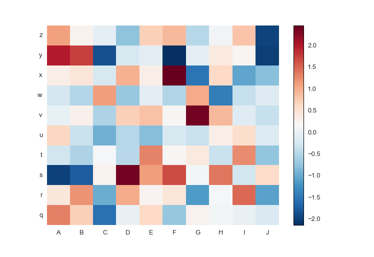
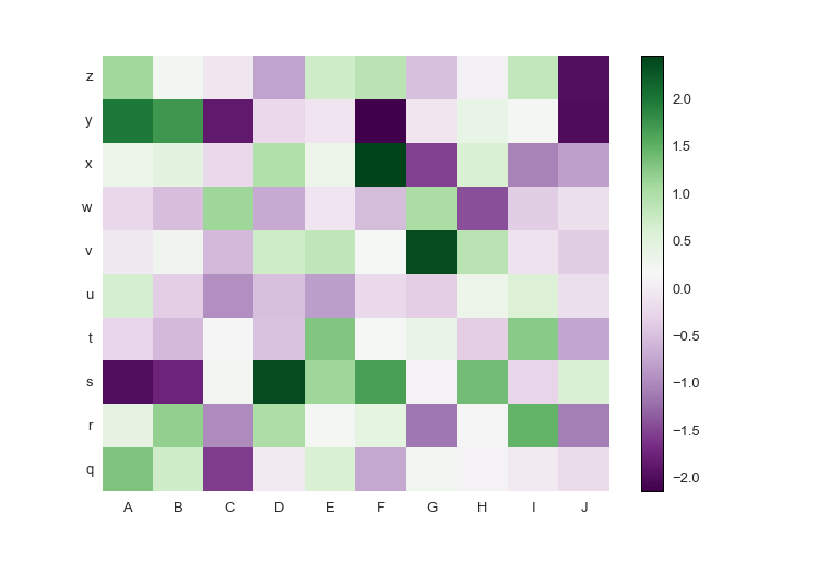
Custom colormaps
Or pick your own colormap! The diverging colormap PRGn or Purple and Green is
pretty nice. I usually use this website to look up the colormaps: Every
Colorbrewer Scale (hover over the colors to get the name of the colormap)
import prettyplotlib as ppl
import brewer2mpl
import numpy as np
import string

green_purple = brewer2mpl.get_map('PRGn', 'diverging', 11).mpl_colormap

fig, ax = ppl.subplots(1)

np.random.seed(10)

ppl.pcolormesh(fig, ax, np.random.randn(10,10),
               xticklabels=string.uppercase[:10],
               yticklabels=string.lowercase[-10:],
               cmap=green_purple)
fig.savefig('pcolormesh_prettyplotlib_labels_other_cmap_diverging.png')
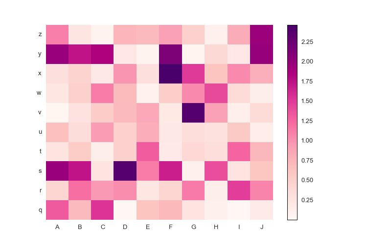
Or if you want your own colormap for positive-only data:
import prettyplotlib as ppl
import brewer2mpl
import numpy as np
import string

red_purple = brewer2mpl.get_map('RdPu', 'Sequential', 9).mpl_colormap

fig, ax = ppl.subplots(1)

np.random.seed(10)

ppl.pcolormesh(fig, ax, np.abs(np.random.randn(10,10)),
               xticklabels=string.uppercase[:10],
               yticklabels=string.lowercase[-10:],
               cmap=red_purple)
fig.savefig('pcolormesh_prettyplotlib_labels_other_cmap_sequential.png')
Log normalization or other parameters
Plus, this will take the usual parameters of pcolormesh like if you want to
rescale your data to log-scale:
from matplotlib.colors import LogNorm
...
ppl.pcolormesh(..., norm=LogNorm(vmin=x.min().min(), vmax=x.max().max()))
The full prettyplotlib code is,
import prettyplotlib as ppl
import brewer2mpl
import numpy as np
import string
from matplotlib.colors import LogNorm

red_purple = brewer2mpl.get_map('RdPu', 'Sequential', 9).mpl_colormap

fig, ax = ppl.subplots(1)

np.random.seed(10)

x = np.abs(np.random.randn(10,10))
ppl.pcolormesh(fig, ax, x,
               xticklabels=string.uppercase[:10],
               yticklabels=string.lowercase[-10:],
               cmap=red_purple,
               norm=LogNorm(vmin=x.min().min(), vmax=x.max().max()))
fig.savefig('pcolormesh_prettyplotlib_labels_lognorm.png')
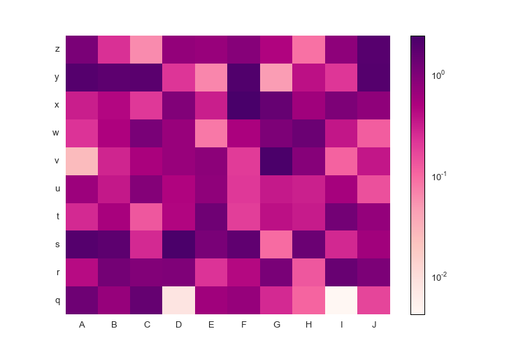
And now you can easily make beautiful heatmaps!
That’s all, folks!
That’s my introduction to prettyplotlib and why you need it. There are similar
examples for the other functions, but these ones for ppl.scatter and ppl.pcolormesh are the most
extensive.